6 Correlation in R
In this weeks workshop, we are going to learn how to perform correlation analyses along with the relevant descriptive statistics and assumption checks.
 By the end of this session, you will be able to:
Use the jmv package to run descriptive statistics and check assumptions.
Conduct a simple correlation in R.
Conduct a multiple correlation R.
Learn how to make pretty correlation graphs.
Conduct an apriori power analysis in R for correlations.
6.1 How to read this chapter
This chapter aims to supplement your in-lecture learning about correlations, to recap when and why you might use them, and to build on this knowledge to show how to conduct correlations in R.
6.2 Activities
As in previous sessions there are several activities associated with this chapter. You can find them here or on Canvas under the Week 5 module.
6.3 Correlations
Todays data was collected from a cross-sectional study examining the relationship between sleep difficulty, anxiety, and depression.
After loading the datasets, it’s always good practice to inspect it before doing any analyses. You can use the head() function to get an overview of the sleep quality dataset:
Now that our environment is set up and our dataset is loaded, we are ready to dive into descriptive statistics & check our assumptions.
Last week we learned how to use descriptives function to do both of these things.
Let’s imagine we’re interested in investigating the relationship between depression and anxiety. Specifically we predict that higher levels of depression (as shown by higher scores) will be associated with higher anxiety levels (as shown by higher scores).
In this case:
Our variables are 1) depression and 2) anxiety
We could specify our hypothesis as such:
H1: We predict that higher depression will be positively correlated with higher anxiety scores.
H0 (Null hypothesis): There will not be a significant correlation between depression scores and anxiety scores
Note that as we do specify the direction of the association / correlation that this is a directional hypothesis.
As we are interested in the relationship between two continuous variables, this would be best addressed via a simple correlation. Before we can do this, there are a couple of preliminary steps we need to take. First, we need to check the assumptions required for a correlation.
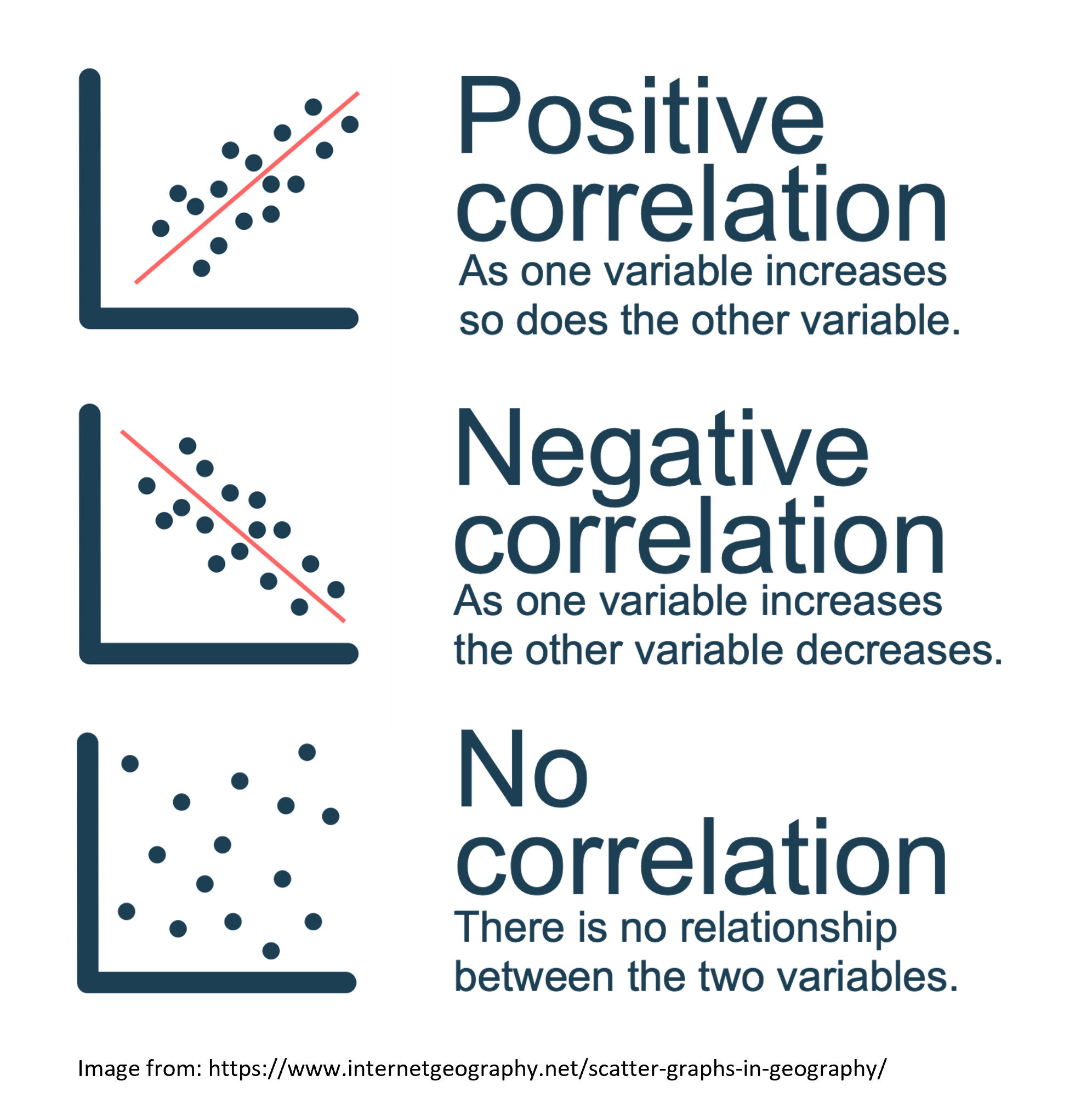
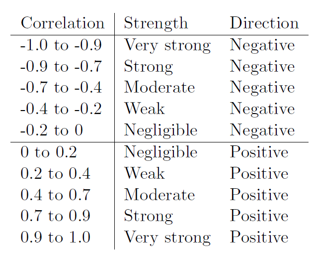
Remember that for correlations the two main outcomes of interest are direction and strength
Direction: In a positive correlation one variable goes up as the other does. In a negative correlation as one variable goes up the other goes down.
Strength: Measured via Pearsons r usually, spans form 0-0.2 (negligible), to 0.9-1 (very strong).
Checking our assumptions
There are two main types of correlation you might use: Pearsons and Spearmans.
Pearsons Correlation: This type of correlation assumes a linear relationship between variables.
Spearmans Correlation: This type of correlation relies on ranks and is more robust against outliers, but is less efficient for large datasets.
For the purposes of this workshop, you would typically use Pearsons correlation, unless the below assumptions are not met.
There are several key assumptions for conducting Pearsons simple correlation:
- The data are continuous, and are either interval or ratio.
Interval data: Data that is measured on a numeric scale with equal distance between adjacent values, that does not have a true zero. This is a very common data type in research (e.g. Test scores, IQ etc).
Ratio data: Data that is measured on a numeric scale with equal distance between adjacent values, that has a true zero (e.g. Height, Weight etc).
For the purposes of this workshop we know our two variables are outcomes on a wellbeing test, as such they are interval data and this assumption has been met
- There is a data point for each participant for both variables.
- To check this assumption we can simply check if there is any missing data, conveniently descriptives automatically tells us this.
- The data are normally distributed for your two variables. Reminder that we can use Shapiro Wilks test to test for this: A significant p-value (p < 0.05) means that the assumption has been violated, and you cannot run Pearsons correlation. A not significant p-value (p > 0.05) means that the assumption has been met, and you can proceed.
For linear models we also use our qqplot to test for this for now. If the dots follow the line for the residuals then this assumption has been met.
descriptives(df_sleep, # our data
             vars = c("Depression", "Anxiety"), # our two variables
             hist = TRUE, # this generates a histogram
             sw = TRUE, # this runs shapiro-wilks test
qq=TRUE) # this generates a qq plot - The relationship between the two variables is linear. We can check this assumption via a scatterplot to visualise the 2 variables. The syntax is below:
If there is a straight line in the dots then we can assume this assumption has been met.
- The assumption of homoscedasticity. For this assumption we could check this visually by to creating a plot of the residuals to test for this. For now however we will use a Breusch-Pagan test (1979). For this test: A significant p-value (p < 0.05) means that the assumption has been violated, and you cannot run Pearsons correlation. A not significant p-value (p > 0.05) means that the assumption has been met, and you can proceed.
This test will come up again next week for regressions (As will plotting residuals) but for now to do this we will create a linear model, and then use the function check_heteroscasticity from the performance package.
If we get a non-significant p-value then the data is homoscedastic and our assumption has been met. The syntax for this is:
nameForModel <- lm(DV ~ IV, data = ourDataFrame) # here we are creating an object "nameForModel" which contatins a linear model of our DV ~ IV
check_heteroscedasticity(nameForModel) # this function performs a Breusch-Pagan test for our model
As we can see our assumptions have been met we can use a Pearson correlation to test our hypotheses.
Running the Simple Correlation
We use the correlation function to perform the correlation. The syntax is:
# Remember you need to edit the specific names/variables below to make it work for our data and needs

cor.test(DataframeName$Variable1, DataframeName$Variable2, method = "pearson" OR "spearman", alternative = "two.sided" or "less" or "greater")

# alternative specifies whether it's a one or two-sided test, or one-sided. "greater" corresponds to positive association, "less" to negative association
Here’s how we might write up the results in APA style:
A Pearsons correlation was conducted to assess the relationship between depression (M= Depression Mean, SD= Depression Standard Deviation) and anxiety scores (M= Anxiety Mean, SD= Anxiety Standard Deviation). The test showed that there was a significant positive correlation between the two variables r(degrees of freedom) = Pearsons r, p = p value. As such we reject the null hypothesis.
Multiple Correlations
Sometimes we’re interested in the associations between multiple variables. In todays dataset we have sleep difficulty, optimism, depression, and anxiety. As such we might be interested in the relationship between all four variables.
In addition to our earlier prediction regarding depression and anxiety we could also predict:
that greater sleep difficulty (as shown by higher values) will be associated with higher anxiety and depression levels (as shown by higher scores).
that greater optimism (as shown by higher values) will be associated with lower anxiety and depression levels (as shown by lower scores).
In this case:
Our variables are 1) depression, 2) anxiety, 3) sleep difficulty, and 4) optimism.
As we are interested in the relationship between four continuous variables, this would be best addressed via a multiple correlation. Before we can do this, there are a couple of preliminary steps we need to take.
A lot of the steps are very similar to a simple correlation. So we can refer to the above sections for help if we get unsure.
Assumptions The assumptions for a multiple correlation are the same as for a simple correlation, we just need to check for all our variables. The pairs.panels function can be helpful to get the relevant visualisations to check our assumptions for all variables.
Notice that pairs.panel gives us the relevant outputs for all variables (including paritipant number.. which we can see is not normally distributed)
Running the multiple correlation We need a slightly different syntax for multiple correlations:
correlation(DataframeName, # our data
select = c("Variable1", "Variable2", "Variable3", "Variable4"), # our variables
method = "pearson" OR "spearman",
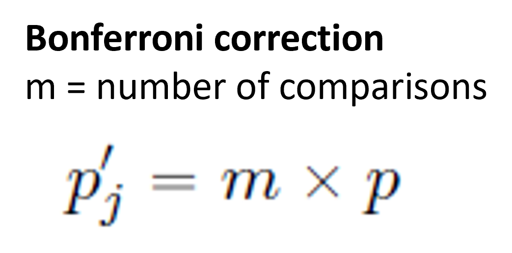
p_adjust = "bonferroni") # our bonferroni adjustment for multiple comparisons
# Note that we do not specify the direction of our predicted correlation here as some may be positive and others may be negativeMultiple Comparisons You may recall from your lectures that conducting multiple statistical tests can be problematic in regards to our alpha level.
When we set our alpha at 0.05 that is setting our Type 1 (False Positive) rate at 5%. If we then run multiple tests however that rate goes up, with the rate increasing with every test you run. One way to avoid this problem is to use adjusted p-values. The one we’re using here is the bonferroni adjustment, which multiplies the p value by the number of comparisons.
Correlation Matrices We need to visualize our data not only to check our assumptions but also to include in our write-up / results / dissertations. As you may see above the write-up for a multiple correlation can be lengthy/confusing, and a good graphic can help your reader (and you) understand the results more easily.
Today we’ll be using the ggcorrplot function. We will learn a lot more about making visualizations in week 9, but for today we will learn how to clearly visualize our correlation results.
If you type in ?ggcorrplot to your console you can see there are many optional arguments you can use to customize your graph.
NB to use ggcorrplot you need to have saved the results of your correlation using the following syntax:
OutputName <- correlation(DataframeName, # our data
            select = c("Variable1", "Variable2", "Variable3", "Variable4"), # our variables
             method = "pearson" OR "spearman",
            p_adjust = "bonferroni") # our bonferroni adjustment for multiple comparisons

# Note that we do not specify the direction of our predicted correlation here as some may be positive and others may be negative
Power Analyses Here we are going to learn about how to conduct a power analysis for a correlation.
As you may recall there are some key pieces of information we need for a power analysis, and some specifics that we need for a correlation:
Alpha level (typically 0.05 in Psychology and the social sciences)
The minimum correlation size of interest
Our desired power
If our test is one or two-tailed (i.e. do we have a directional or nondirectional hypothesis)
The syntax for conducting an apriori statistical power analysis for a simple correlation is the following: